Blog Layout
Mid-Century Modern Pop | Blend Interior Design Studio
Felicia Farrar • Oct 02, 2023
This Mercer Island Residence had a large flood in their basement, ironically right after visiting a friend’s house that utilized their updated basement and the clients were already speaking about updating the space. After the contractor was hired, we came on to the scene.
Damage plus wanting to update to the space and needed a design plan to make the space more efficient.
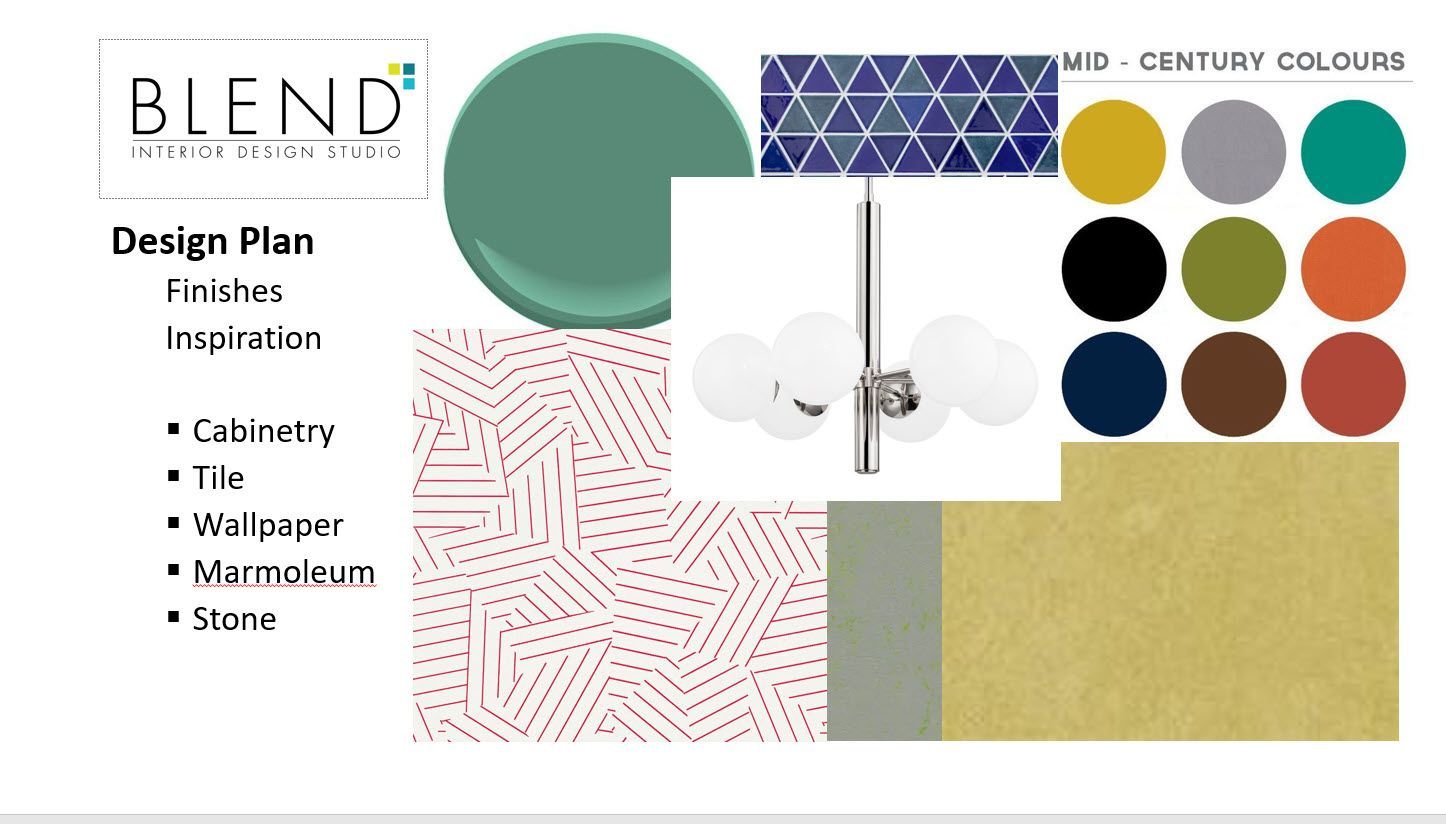
Great Room Inspiration Board Blend Interior Design Studio began to pull products and textures together for a mid-century vibrant color scheme. The main areas had marmoleum flooring in mustard and green shimmer, bright tiles and cabinetry- with just enough white integrated into the space to make it not overwhelming. Words- changed the layout, challenge for longer room. Choose to go with European Cabinetry, which had its own challenges when designing the space.
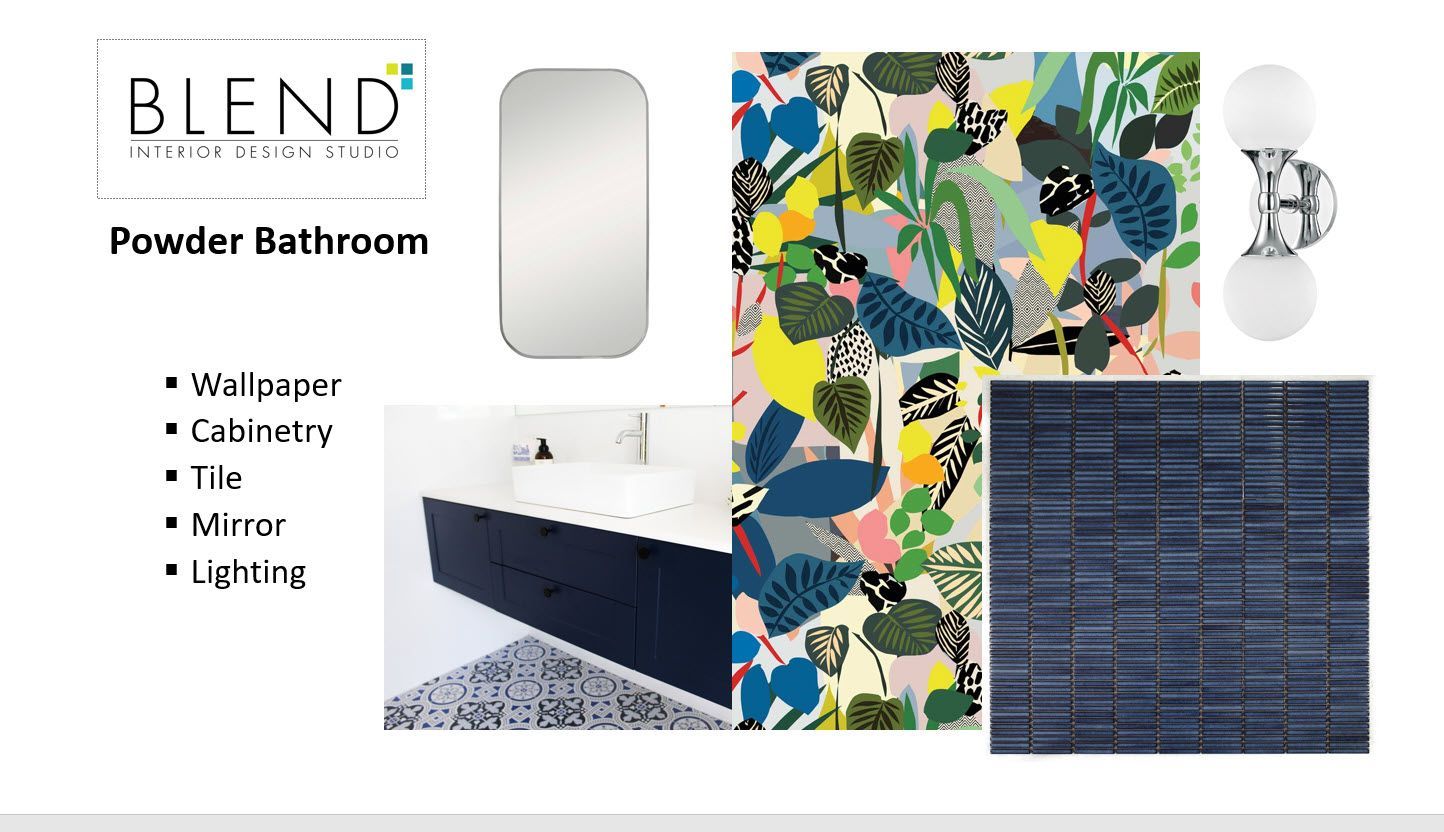
Powder Bath Inspiration Board The powder bathroom was a great opportunity to bring in some colorful, vibrant wallpaper, starting with this pattern- the tiles and floating cabinet paired wonderfully with the vibrant paper. A sleek modern mirror with round sconces finish the look. Inspiration boards help me to visualize what the products will look like together in the space.
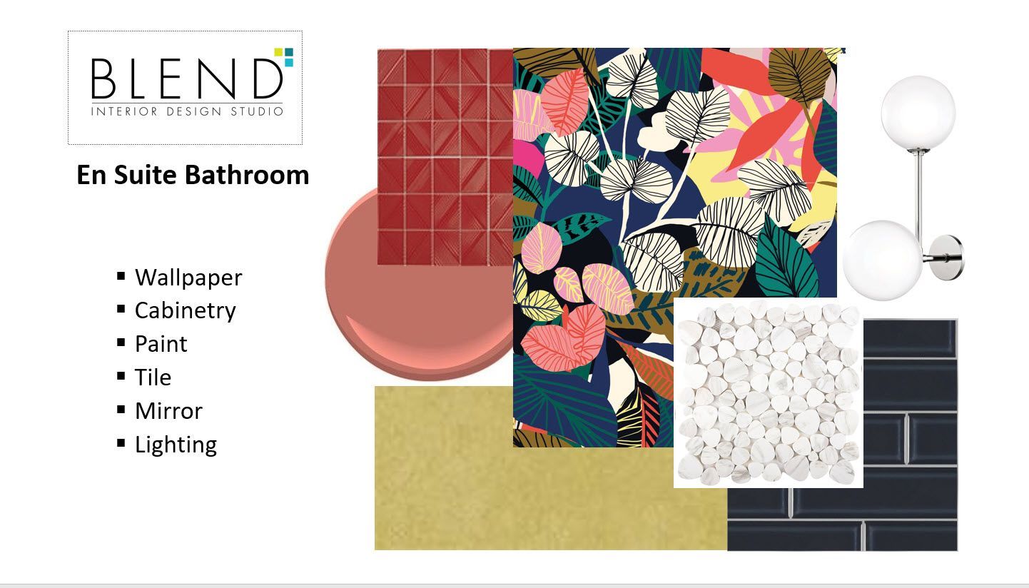
Ensuite Space Inspiration Board We opened up the shower area – removing a wall in the ensuite and used another dynamic patterned wallpaper for the vanity area- once again the floating cabinet gives the bathroom storage opportunity with a lightness from the floating cabinet. The walk-in shower is flanked with “boutique chic tile” and a fun pebble stone accent. A new linen cabinet added additional storage and a red/rose colored paint finished off the space.
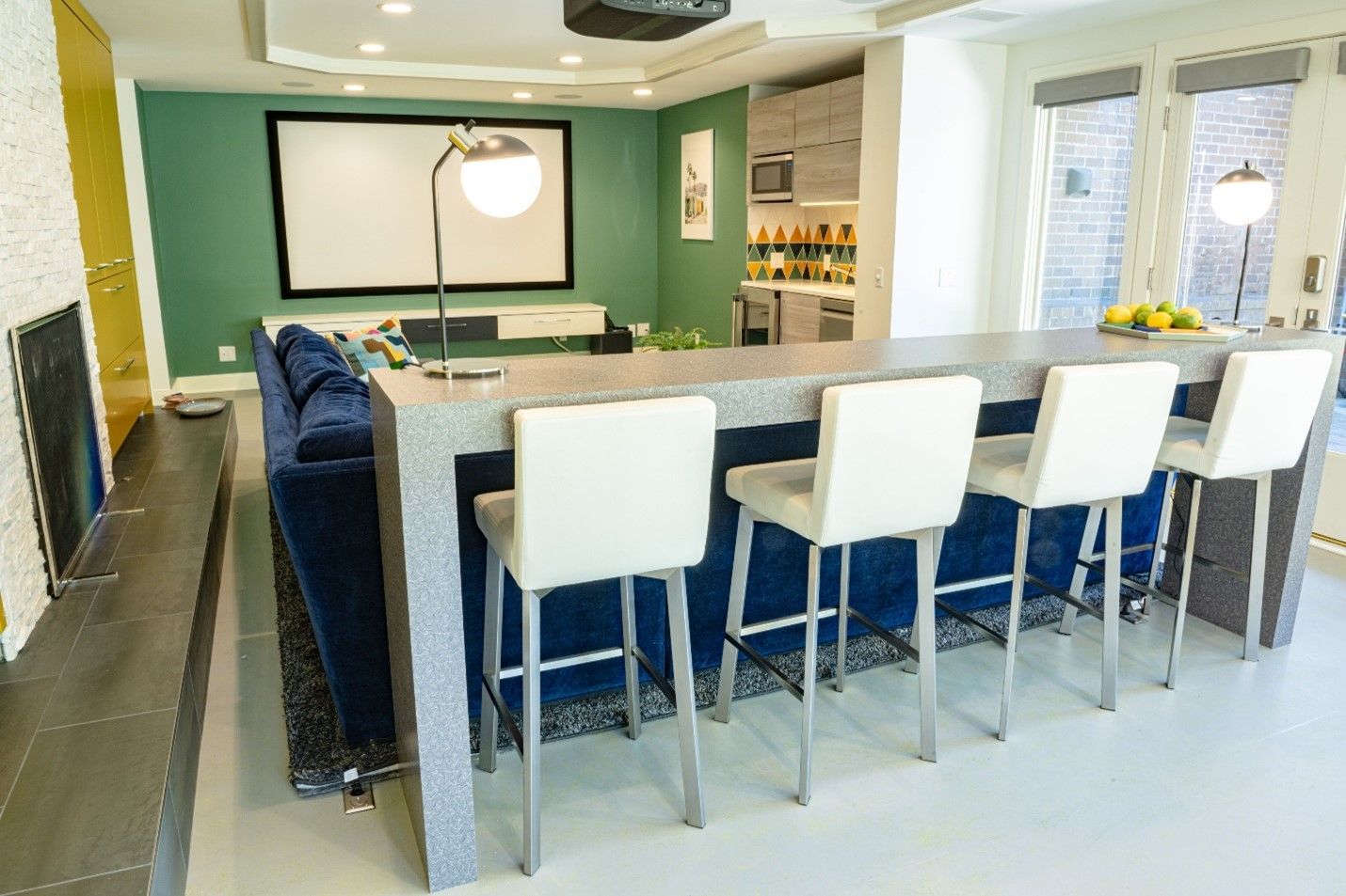
Great Room Finished Space planning the main great room moved from original TV in the built in cabinetry to the west wall with a projector. It was important because the space was very long but not very wide so we had to make the best use of the area by creating a game table in the far corner with a nice chandelier light above it for easy focus. Blend designed this bar table to utilize the space behind the sofa so guest or family can sit here and enjoy the movie or eat and drink comfortable. The kitchenette tucked into an alcove across from the fireplace allowed for food prep and easy access to cold drinks. The large sofa allows for the family to gather to watch movies or just hang out and enjoy each other’s company.


Here is a visual of the finished bathrooms. One can see how it all came together with wallpaper, globe lighting, European cabinetry and tiles.


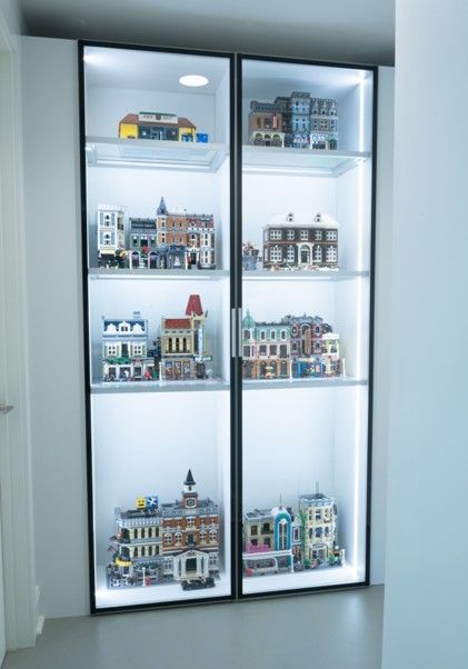
Display cabinet for the clients Lego sculpture pieces, cabinetry by Bauformat.
By Felicia Farrar
•
12 Dec, 2023
How to hang art so that it is visually appealing
By Felicia Farrar
•
18 Aug, 2023
There are many benefits to a good interior design plan that fits the personality and lifestyle of a client. Today I am going to briefly discuss some of the more significant outcomes of a pleasing interior. It has been proven that the ability of interior design elements can evoke a positive or negative emotional response in people. These findings open the door to design spaces that consciously manipulate decorative elements with the goal of encouraging creativity, peace, and happiness.” A. The first benefit is to mental health and how the psychology of design can elevate or diminish a persons mood depending on the enjoyment and associations with their interior. B. The second is the daily comfort with the personalization of your space. Feeling like it reflects who you are and represents the lifestyle you want to live. Research shows that high life satisfaction correlates with better health, the absence of difficulties such as depression, or sleep disturbances. Furthermore, individuals who are satisfied with life are good problem solvers and tend to be more resistant to stress. Principals of Design Help Us Feel Balanced There are many mental health benefits to a harmonious interior. Probably the most beneficial is that it gives one a sense of control of their lives. Also, an important aspect of this is that they have a safe haven from the world that they are comfortable in and this space functions well for them. Of course, there are general features of spaces that work as a positive elements to begin with like good lighting, spaciousness and earthly elements. Principals of design –are different techniques used in interiors to create interest -Balance, proportion, symmetry, emphasis, rhythm and contrast play a big part of an interiors that flows throughout the space. Here are some examples of these principals in design. The Color of Memory In a time when the outside world is so unpredictable, to have a home that you feel safe, comfortable, and happy is Important. Things in your environment that make your space more personalized, like colors you enjoy seeing and textures you enjoy touching. There are some general feelings colors bring on- Red Red is the color of power, aggression, and passion. It also triggers the appetite (which is why it is such a popular color in restaurants.) Red promotes appetite and a sense of urgency, which may be why so many stores and restaurants use the color red. Orange Orange is associated with energy, sports, competition, and innovation. It’s another warm tone that can quickly make a space feel snug and cozy. -Orange and yellow may promote optimism. Yellow Yellow is the only warm color associated with relaxation. It is associated with happiness, creativity, and innocence. Blue This is a color that communicates fresh, calm, serenity. It is a conservative, orderly color that works well in professional settings. It’s popular in health offices and financial institutions. -Blue is said to promote productivity and a sense of security. Purple This is an indulgent color that evokes feelings of luxury, privilege, and specialness. It is a ceremonial color used in many religions to connote divinity. Purple is said to support problem-solving skills and promote creativity. Black Many people think that black is the absence of color, but in fact, black absorbs all light in the color spectrum, meaning it is the combination of all colors. When you add many leftover paint colors together, it often creates black. Research in color psychology shows that black evokes many different associations. It is often linked with death, unhappiness, and mystery. But it’s also the color of sophistication, seriousness, intellectualism, and sexuality. Black is not a cheerful color, so it’s usually used as an accent. When used sparingly, black elements can create calming harmony and balance in a room. Liberal use of black can also make an area look powerful, dramatic, or important. White White is a neutral color that is common in most homes. Most ceilings are white, and this color is the most popular choice for walls. White reflects light, making rooms feel brighter, more spacious, and bigger. It also evokes feelings of cleanliness, purity, and innocence. Personal Associations While there is plenty of research that shows how most people react to colors, personal experience with a color usually outways social norms. Our personal history influences our emotions around colors.
CONTACT INFORMATION
Phone: 206-965-0023
Email: felicia@blendids.com
Address: 1221 Minor Ave., Unit# 411, Seattle, WA 98101
Business Hours:
- Mon - Fri
- -
- Sat - Sun
- Closed
Content, including images, displayed on this website is protected by copyright laws. Downloading, republication, retransmission or reproduction of content on this website is strictly prohibited. Terms of Use
| Privacy Policy